Twitter has been telling users about a refresh coming to the social media platform.
These are some of the changes rolling out across twitter.com, Twitter for iOS, Twitter for Android, TweetDeck and Twitter Lite over the coming days and weeks. Here’s what you’ll see:
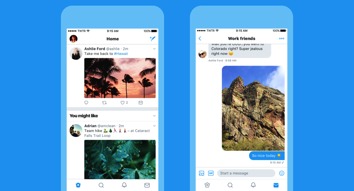
• Profile, additional accounts, settings, and privacy – all in one place! A new side navigation menu and fewer tabs at the bottom of our app = less clutter and easier browsing.* You told us you loved this change on Android last year and we’re excited to now bring it to iOS.
• Links to articles and websites now open in Safari’s viewer in the Twitter app so you can easily access accounts on websites you’re already signed into.*
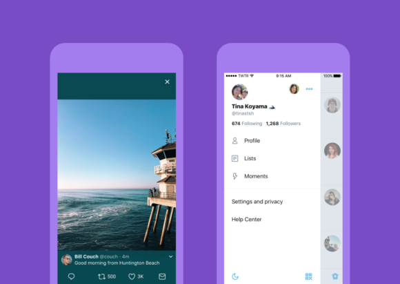
• We’ve refined our typography to make it more consistent, and added bolder headlines to make it easier to focus on what’s happening. Also, rounded profile photos make it clearer to see what’s being said and who’s saying it.
• More intuitive icons make it easier to engage with Tweets – especially if you’re coming to Twitter for the first time. For example, people thought the reply icon, an arrow, meant delete or go back to a previous page. We switched to a speech bubble, a symbol most know and love. We also made the icons lighter for more seamless interaction.
• Tweets now update instantly with reply, Retweet, and like counts so you can see conversations as they’re happening – live.**
Also, you’ll see additional accessibility choices such as increased colour contrast and the option to always open supported links in Safari Reader view.*
*iOS only
**Not available on twitter.com and Twitter Lite