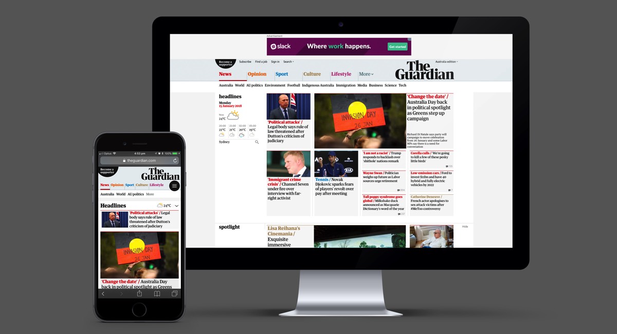
The Guardian has launched a global digital redesign to coincide with the launch of its new Guardian tabloid newspaper in the UK.
The mobile-first design aims to meet the needs of The Guardian’s growing digital audience across the UK, US, Australia and rest of the world.
The Guardian also this week unveiled a new masthead to be used across its print and online assets, replacing the blue and white masthead that has been used since 2005.

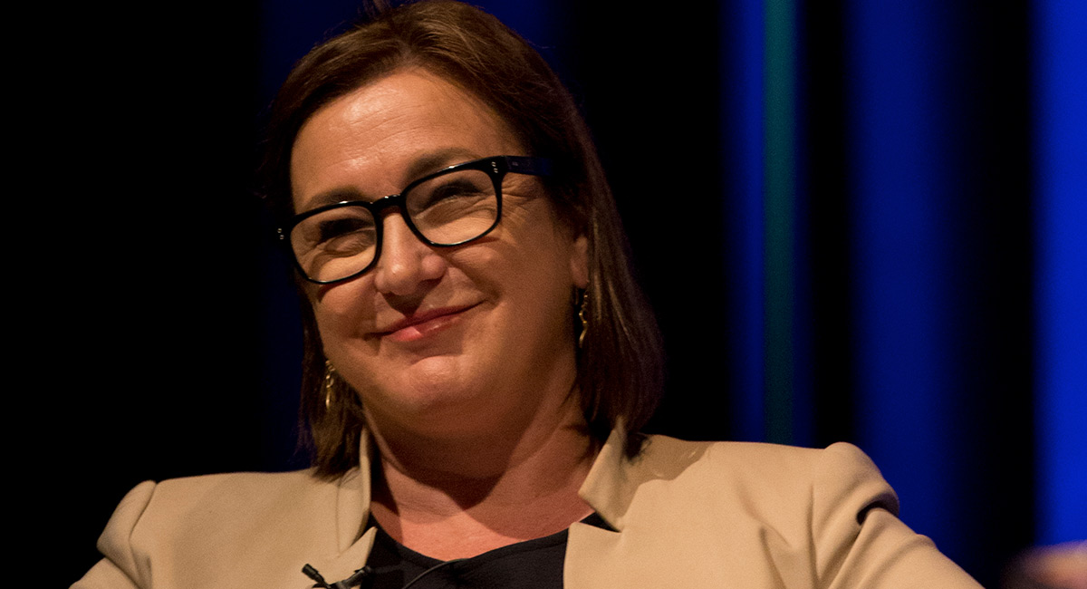
Guardian Australia editor Lenore Taylor
The digital overhaul coincides with new versions of its print products in the UK, which see the paper change from its unique Berliner format to the tabloid size.
Guardian Media Group continues to implement its three-year transformation plan with the target of Guardian News & Media breaking even at operating level by April 2019.
Guardian News & Media editor-in-chief Katharine Viner said: “Since we announced our plans to change format seven months ago, it’s been an exhilarating period of creativity, imagination and focus, and I’m thrilled with the result: a new paper that feels bold, striking and beautiful, and still unmistakably The Guardian. It has also been a fantastic opportunity to redesign our website and apps. The new Guardian will be a space for big ideas, for debate, for clear thinking and new perspectives.”
Guardian Australia editor Lenore Taylor said: “Guardian Australia readers will notice a new look to our site with a new masthead and design. Our commitment to high-quality independent journalism and to reporting important Australian stories remains the same.”
