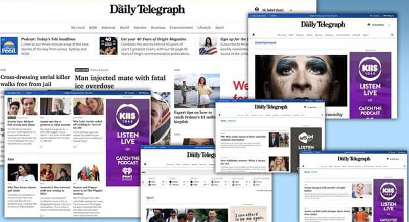
News Corp Australia NSW news brand The Daily Telegraph has flipped the switch on its new-look website. The move comes after The Advertiser previewed the new company-wide re-design earlier this month.
The website explains the changes to readers today:
Today, readers are discovering a whole new dailytelegraph.com.au.
NSW’s premier news, sport, entertainment and information website has been rebuilt from the ground up to be faster, smarter, less congested and much more user-friendly.
For the past year, we have spent hundreds of hours with people all over Australia to find out what they want from their news websites and mobile sites.
Our new suite of digital products gives our audience what they’ve asked for.
They asked for speed: we’ve delivered, by building one of the quickest-to-load news sites of any publisher, anywhere.
See also: News Corp new look: Julian Delany on revamps of digital metro mastheads
They asked to be able to find what they’re looking for more easily: we’ve delivered, by presenting a design that is clean and simple plus an intuitive navigation system that means users are only ever one click away from their area of interest.
They asked for more relevant content: we’ve delivered with more community news coverage across the state and personalised recommendations based on your reading habits. And in coming weeks, we’ll introduce topics that enable all content about that subject to be collected on one page.

News Corp Australia’s chief technology officer Julian Delany said the dramatic rise in consumer expectations around digital products in recent years has prompted a rethink in what News offers to its audiences.
“We’ve spoken to Daily Telegraph, Sunday Telegraph and NewsLocal readers to listen to their views and hear directly what they want and expect from a digital news product,” he said.
See also: The Advertiser reveals first look at new suite of News Corp digital products
