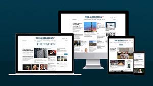
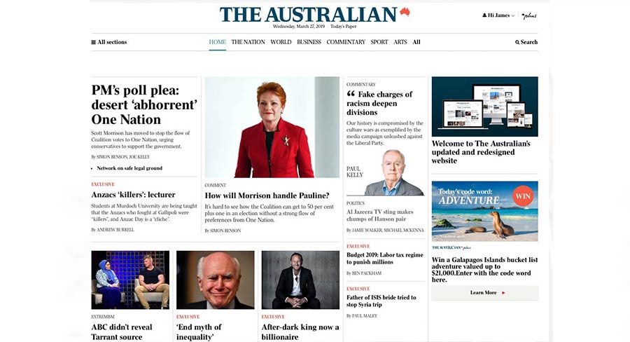
After releasing a test version of its website for a limited number of subscribers, The Australian has now moved all visitors over to its updated and redesigned website.
The News Corp Australia newsbrand has offered readers this introduction from digital editor Daniel Sankey and general manager digital Stuart Fagg:
The changes have been carefully designed to simplify the experience and make it easier to find the features you love, from our award-winning news coverage to your favourite columnists.
Importantly, our new website brings our printed newspaper and our digital content closer together than at any time since The Australian launched its first website back in 1997.
To that end, our website sections now match the newspaper’s sections and liftouts and you will find the newspaper’s distinctive typography across the website. We’ve also increased the width of the website on large screens, giving a real broadsheet feel to the new pages.

As The Australian has developed in the digital age, so too has our journalism and our new website is designed to place that coverage at the centre of your experience.
Whether it be live coverage of breaking news, political analysis that holds the nation’s leaders to account, a gripping podcast or a long read from The Weekend Australian Magazine, our new website brings our content to life on whichever device you choose to use.
Making changes to The Australian is not a task we have taken lightly.
For many of you it’s a part of your daily routine and the trusted source you turn to for critical analysis and coverage of the events shaping our nation, and the world.
