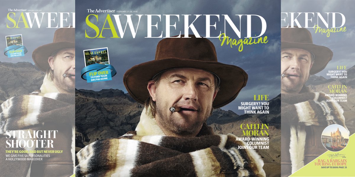
The Advertiser’s insert titles SAWeekend and Real Estate Magazine have joined forces to become a 100-page magazine.
The two titles will continue to operate and curate content independently, but will be housed in the same book in the style of a flip book.
“It’s like you’ve got two magazines, and you’ve stuck the two together upside down,” SAWeekend editor Roy Eccleston explained to Mediaweek.
“What happens is when the content is sent to the publisher, they come together at that point. It’s not like I need to work with the Real Estate Magazine team in any way. It’s not like we don’t talk to each other, but we don’t need to work together in order to get the magazines out.”
Before the merger of the titles into one book, the stand-alone print issue of SAWeekend was about 40 pages long. This will not change.
“The first edition of the new look was 44 pages. Generally speaking we stick to 40 pages, and if the ads justify it then we’ll go to 44 pages or more,” Eccleston said.
He agreed that the new format might cause some confusion for the reader, but said that would subside within five minutes of picking up the first new-look issue.
“It’s understandable when you change something that’s much-loved, people are going to say, ‘Well, is this really an improvement?’ It’s a learning process in the first few weeks. But there is no doubt in my mind that it’s the best looking magazine we’ve ever made,” Eccleston declared.
Since its establishment in 2008, Adelaide’s SAWeekend magazine had been printed on newsprint.
“I’ve been here since day one and it’s been a constant frustration of mine that we haven’t looked as good as I know we can be,” Eccleston confessed. The glossy pages of the magazine have put that annoyance to rest.
“While the product was good, it didn’t look like a magazine you might buy off a newsstand,” he said. “When it comes to printing on a glossy paper you are going to get a much more vibrant impact especially from photographs.
“When it came to printing, the photographs weren’t given justice. Now, they will.”
The merger of two titles into one book allows both of the titles to expand their reach and lure in audience that may not have picked up the SAWeekend or vice versa.
“We didn’t just dream this up and decide to do it,” Eccleston stated. News Corp’s The Advertiser masthead conducted tests on focus groups, and collected feedback on the new look from about 1,000 readers, he revealed.
“The overwhelming view was that this was going to introduce a lot of new readers to SAWeekend and would increase the audience reach of the product, as well as the interest in the magazine.
“Hopefully this translates into extra advertising as well,” Eccleston said. “From an advertiser’s point of view, the ads look so much better and that’s what they care about obviously, as well as the reach of the product.”
The relaunch of the title with a new format was necessary, Eccleston stated. While the magazine has retained much of its style in terms of writing and photography, it has made some tweaks to its presentation. It has also added UK writer Caitlin Moran to its kitty of columnists.
“All the polls we’ve done show that it’s the second-biggest reason why people buy the Saturday Advertiser.
“We are SAWeekend, SA meaning South Australia. There’s a lot of South Australian content in the magazine. At the same time, we know that our audience is an intelligent audience and is interested in what’s happening beyond the boundaries of the state. So we get the best writing from interstate and occasionally get the best journalism from US and UK,” Eccleston said.
When asked about the magazine’s target market, Eccleston answered: “It’s a wide target audience and that’s why it’s been so successful.”
