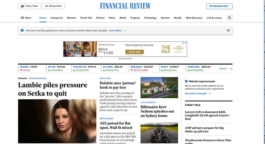
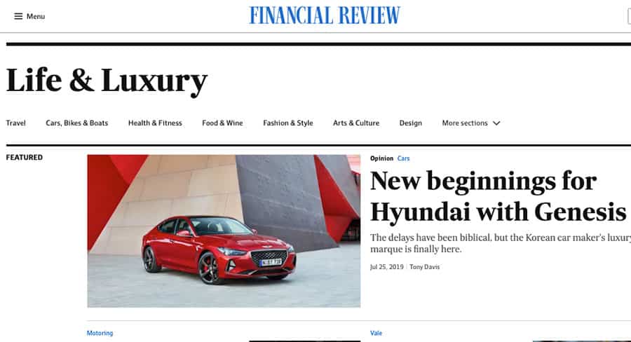
The Australian Financial Review has revealed a redesigned homepage, improved article pages, optimised navigation and more in a digital refresh.
Here is how the Nine publishing title is explaining the changes to readers:
To make it easier to find the topics and insights that are important to you, we have changed the way we categorise stories on afr.com by introducing tags that label coverage in a more meaningful way.
Our redesigned section pages are easier to navigate and better showcase the depth and breadth of the Financial Review. You can deep dive into our content and feel confident you are up to date with the latest stories.
Simplified story layouts make it easier to focus on our unrivalled news coverage and analysis and our new feature article format makes your reading experience richer by highlighting the high-quality images from our award-winning magazines.

Our website is now consistent across all devices so you can be sure you haven’t missed any of the latest news during your commute.
We have also refined our website navigation to align our online and print sections. Spend more time with the news that is important to you with redefined sections.
• Stories from the News section have been split into Politics, Policy, and World
• Business is renamed Companies
• Real Estate is renamed Property
• Personal Finance is renamed Wealth
• Leadership is renamed Work & Careers
• Lifestyle is renamed Life & Luxury
