
Korean Air unveils first major rebrand in 40 years via Lippincott
The new identity signals global ambitions following the Asiana merger.

Korean Air has unveiled a bold new brand identity, the first in 40 years, as the airline moves to solidify its status as a top-tier global carrier. The redesign, led by global consultancy Lippincott, reflects the airline’s evolution and Seoul’s growing prominence as an international aviation hub.
The rebrand comes at an important time for Korean Air, following its merger with Asiana Airlines, a move that positions the airline among the world's largest. The refreshed identity leans into Korean Air’s “Excellence in Flight” ethos, elevating both Business and First-Class offerings and enhancing the passenger experience with a hospitality-inspired touch.
 Lippincott’s unique reinterpretation creates a modern and premium brand, respectful of the past but positioned for the future as the airline transforms, following its merger with Asiana, from a national carrier to a global top-tier airline.
 The redesign, led by global consultancy Lippincott, reflects the airline’s evolution and Seoul’s growing prominence as an international aviation hub.
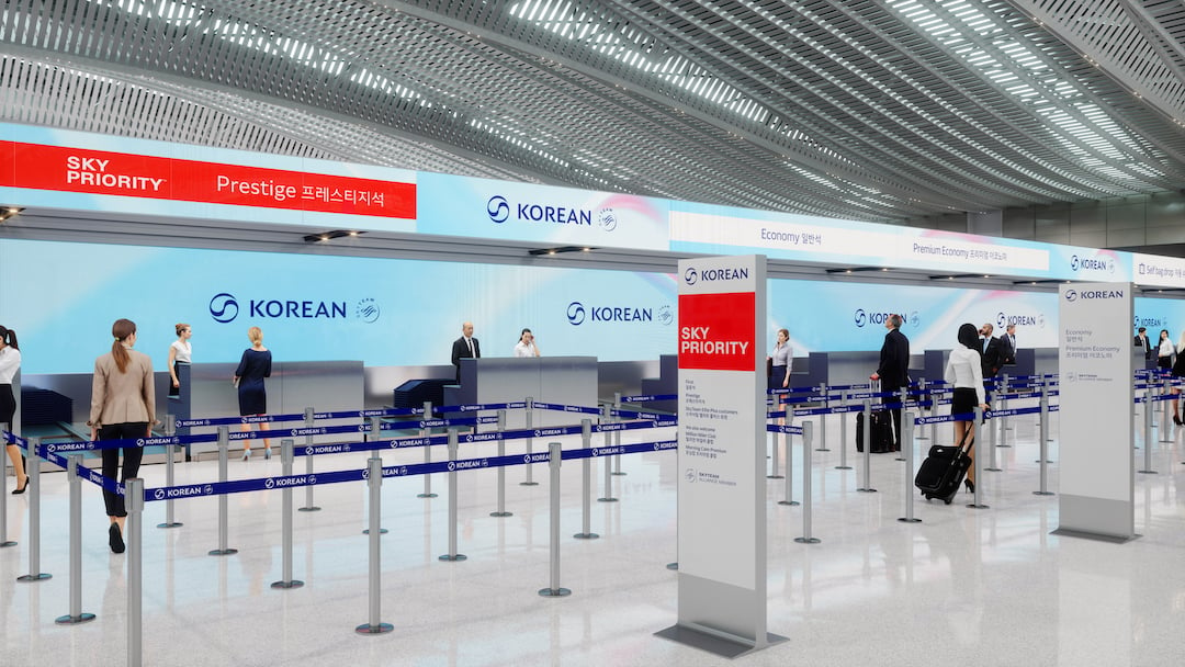 These updates extend beyond the aircraft, reaching into the airline’s digital platforms and customer touchpoints.
A reimagined Taeguk symbol & modern logotype
At the heart of the new identity is a revitalised Taeguk, the national symbol of South Korea, famously featured on the country’s flag. The refreshed design blends the strength of the original mark with the elegance of Sangmo Nori, a traditional Korean dance known for its fluid ribbon movements, symbolising prosperity and abundance.
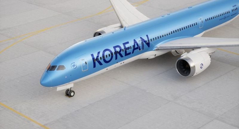
The logotype has also been refined to exude sophistication, inspired by high-end hospitality. In a significant shift, the word "Air" has been dropped from the fuselage, allowing “Korean” to take center stage. The move reinforces Korean Air’s flag carrier status and enhances brand recognition across international airports.


The leading media trade publication in Australia.
Get our top stories straight to your inbox daily by signing up to our Newsletter
By providing your information, you agree to our Terms of Use and our Privacy Policy. We use vendors that may also process your information to help provide our services.
Dan Vasconcelos, partner and creative director EMEA at Lippincott, said: "For over 40 years, Korean Air’s blue-top livery has been nothing short of iconic. It has been a privilege to refresh and reinvigorate this instantly recognisable brand into a modern, premium new look."
 The new plates and menus for first class will appear on board in phases, starting this week.
Aviation meets luxury
The refreshed branding extends beyond the logo, seamlessly integrating across physical and digital touchpoints. Korean Air has retained its signature blue palette but introduced subtle variations and deep neutral tones in its redesigned cabin environments, enhancing the luxury experience for passengers.
Michael D’Esopo, CEO of Lippincott, described the project as a balancing act between history and modernisation: "It was an honor to partner with Korean Air on this far-reaching project—which draws on Lippincott’s expertise in both aviation branding and establishing post-M&A brands to build connection and progress for the future.
"Our cross-functional global team has worked closely with the Korean Air team to balance the rich history and heritage of the brand, while also creating a unique reinterpretation focused on the future. We look forward to this new identity serving as a visible signal for Korean Air to affirm its flag carrier status while standing apart from other organisations."
More from Mediaweek
The leading media trade publication in Australia.
Get our top stories straight to your inbox daily by signing up to our Newsletter
By providing your information, you agree to our Terms of Use and our Privacy Policy. We use vendors that may also process your information to help provide our services.


