Creatives have been gushing over British Airways’ latest trend-bucking, rule-defying out-of-home ads.
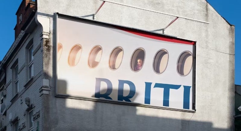
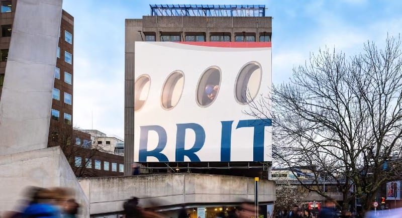
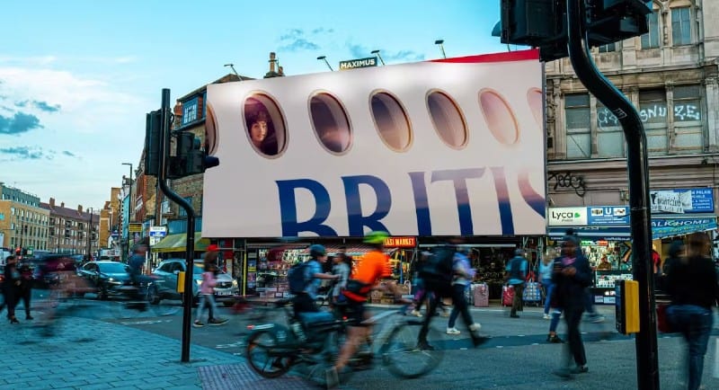
Created by Uncommon London, the work is a series of fragmented, hyper-close up billboards that capture individual passengers in a moment of peering out of the plane window. Most brazen of all: they don’t include the entire logo.
Hulsbosch’s creative director, Marcel Wijnen, tells Mediaweek that British Airways now joins the distinguished ranks of global brands like Pepsi, Coke, Snickers, KFC, and McDonald’s, all of which have innovated their ownable assets to convert brand awareness into the more valuable – and more elusive – brand love.
Describing it as a genuine piece of human real estate, Wijnen says, “the new British Airways campaign demonstrates the power of the simple idea expressed with simplicity.”
“It’s all about stripping communications down to their absolute core, to capture that singular, universal, transferable, emotionally charged golden nugget, the ‘idea’.
“In a world so full of push messages that tell us how to feel, what to do, where to click, these kinds of campaigns appear like a breath of fresh air, allowing viewers to simply see, relate and reflect.”
But what’s the Australian equivalent? A piece of work that breaks the rules, that immediately signals client-agency trust, that feels simple but special?
TBWA\Australia’s associate creative director Cat Williams calls out a recent campaign for Melbourne’s iconic Crumpler bag by PHC Films that explores a similar theme to the British Airways ad: “humanity executed simply. Less light on the product, more light on the person experiencing it.”
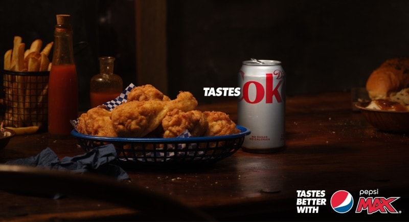
Creative partner at DDB Sydney Jenny Mak, offers the playfully provocative ‘Tastes Ok’ campaign for Pepsi by independent creative agency Special as yet another locally impactful, bold logo use case.
See also: Special and Pepsi Max poke fun at Coke in new ‘Tastes OK’ campaign
“By featuring a can of Coke, Pepsi not only acknowledges its competitor but also demonstrates confidence in its own product,” says Mak.
“This bold move grabs attention and encourages consumers to reconsider their choices.”
Mak says there are many reasons why the British Airways’ campaign is so effective, namely the fact “it makes you feel something.”
“The image perfectly taps into that feeling of wonder, anticipation and awe when flying at 35,000 feet,” she says. “The simplicity of the image tells the story of the brand, with no headline, claims or CTA required. It’s beautiful, simple and elegant.”
TBWA’s Williams says the British Airways campaign’s TV film, directed by Emmy award winner Miles Jay, which accompanies the OOH under the airline’s latest ‘A British Original’ brand positioning is “beautifully captured,” but calls the OOH “specifically, incredible.”
“Leading with human storytelling gives people a real way to connect with a brand. Logos don’t do that.”
“The tight cropping and highlighted facial expressions captures the power of travel. Reminds me I want be in that seat, put my hand up to that window.”
Williams wishes we saw more confident work from confident clients and agencies. Creatives should take note of why the British Airways work works.
“Whether you agree with it or not, it sparks conversation. A brand trusting its reputation to know we will recognise it not in its entirety is bold. More brands should have the confidence to do this.”
“Breaking the rules of advertising is exactly what creatives should always seek to do. Do stuff that’s different, unexpected and real. That’s the work that people want to pay attention to.”
DDB’s Mak agrees not many brands are brave enough to dare tamper with their logo. However, a logo left untouched for decades earns the right to experiment, as is the case with British Airways: “by cropping the logo out of the shot, the focus is clearly on the emotional connection – but it’s still recognisable as British Airways.”
On LinkedIn, Michael Beveridge stressed that it’s been 27 years since a marketer dared to touch the British Airways logo. He described the outdoor spots as a “gold standard of ‘show don’t tell’ but also gold standard of ‘just leave the logo alone m8’ and one day you’ll be able to have fun like this.’”
Beveridge, head of creative and brand at New Zealand-based accountancy Hnry, and co-founder of the full-stack creative consultancy Ouzo Studio, cautioned the “sub-10yo startup creative sweeties” that their key takeaway should be “less about ‘hide the logo’ (absolutely not – you haven’t earned that privilege by a country mile – make it bigger if anything) but rather to showcase both the product/service and the human benefit.’”
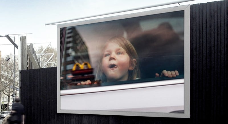
Hulsbosch’s Wijnen draws a comparison to the 2020 work ‘The ‘M’ Effect’ campaign for McDonald’s by TBWA\Belgium. It portrays children gazing wistfully out of car windows that reflect the McDonald’s Golden Arches. He notes, “both [pieces of work are] fusing iconic brand identities with a human truth and the highly emotional idea of ‘wonderment.”
Wijnen also draws similarities with the famous ‘Share a Coke’ campaign, which debuted in Australia in 2011 via creative agency Ogilvy. The campaign took Coca-Cola’s packaging and replaced the logo with people’s names – an initiative that has since been adopted by 70 countries.
See also: Coca-Cola launches AI tool to create shareable and bespoke digital Christmas cards
In all instances, he suggests that success hinges on iconic brand identities, plus a healthy dose of loveable and reputable sentiment.
“Without these two conditions – these campaigns wouldn’t have such positive impact.”
