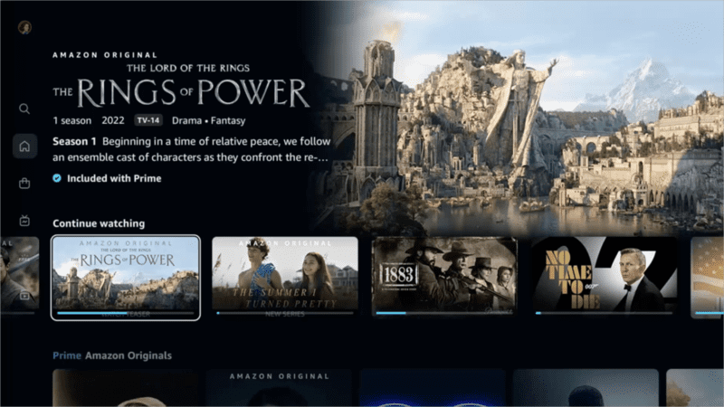
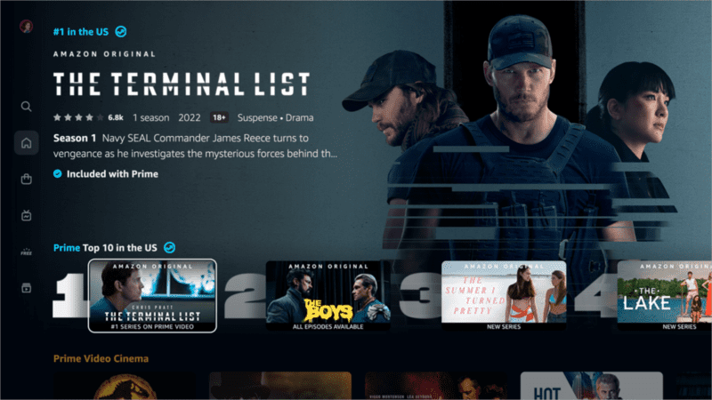
Prime Video has announced a new, redesigned experience within the Prime Video app on connected living room devices.
The updated interface, coming first to Prime Video on living room and Android devices, will be available to all Prime customers worldwide by the end of August.
The new updates include, a more friendly navigation menu, an easier way to watch live and programmed sports, a faster way to watch shows, clearly marked content, and immersive visuals.
The user-friendly navigation menu aims to be easily accessible from anywhere in the app. This helps customers browse the streaming service’s selection—including movies, TV shows, sports, and premium channels—and find what they’re looking for quickly and easily.
Customers have an easy path to the titles included with Prime membership, such as The Marvelous Mrs. Maisel, The Boys, and the highly anticipated The Lord of the Rings: The Rings of Power.

The app will launch with six primary pages: Home, Store, Find, Live TV, Free with Ads, and My Stuff. Customers will also have sub-navigation options to more easily browse by content or offer type, e.g., “Movies” or “TV shows” on Home and “Channels” or “Rent or Buy” on Store.
Home will contain a “Sports” sub-navigation menu. Also, the new Live TV page functions as a hub for streaming stations, including live sports and other events. The content is presented in a user-friendly program guide so customers can view everything that is currently on-air and find out when future programming will begin.
Users can watch Thursday Night Football exclusively on Prime Video, as well as a variety of sports content available with their Prime membership and through subscriptions such as Paramount+ or MLB.TV.
The new Prime Video app comes with new carousels that enable customers to quickly and efficiently find something to stream. For example, Prime’s “Top 10 Chart” taps into the social zeitgeist, showcasing popular and trending content on Prime Video in a highly visual and easily navigable manner. It’s “Super Carousel,” with its larger, poster-style artwork, allows featured titles, such as Amazon Originals and Exclusives and Prime Video Cinema, to stand out against all other titles.

Additionally, the new design features allegedly make it easier for customers to tell what content is included with their Prime membership vs. what is available for purchase. The platform will employ new visual cues to clearly indicate which videos are included for users (marked with a blue checkmark icon) and which are available to rent, buy, or subscribe (marked with a shopping bag icon).
Finally, the new Prime Video experience presents content with rich, immersive imagery, thoughtful details, and a new colour palette.
