Mark Forbes, editor-in-chief of The Age, welcomes readers to a new-look website for the Melbourne newspaper:
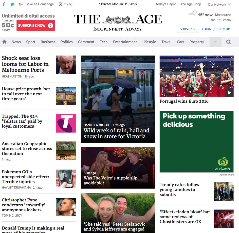
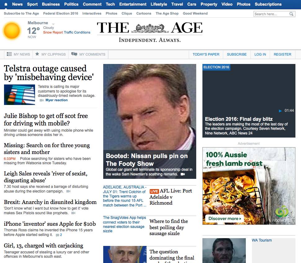
We have redesigned the site with one thing in mind – to ensure we can deliver the best user experience on your browser regardless of what device you are using. We’ve utilised a clearer and cleaner design to make it easier to read and locate our stories.
Our audiences are some of the fastest-shifting digital audiences in Australian news, with more and more of our users not only reading the news on their desktops, but also consuming news on their smartphones and tablets.
Readers value our quality content, but they want it fast, and they’re using multiple devices throughout the day to read it.
Theage.com.au is already the most popular Victorian-based news website, but we wanted to make it more attractive, simpler and user-friendly.
We’ve had a dedicated team of editorial, product, user experience, design and development working for the last year. It might look like a simple task, but we have a multitude of components across the site that all needed redevelopment to ensure they work across desktop, smartphone and tablet screens.


