Whether it’s a childhood jingle that you can still sing word for word or a campaign that influences the way you work today, everyone has an ad that has really stuck with them.
Mediaweek has been asking the industry to take a trip down memory lane to find out all about the ads that made us.
Benny Moore, founder, Benny Moore Design; chief creative officer, Seoul Tonic; and creative consultant, SKMG
I’m currently sitting at a cafe in Hongdae, Seoul. Sipping quietly and typing furiously, I’m re-writing this at the last minute because I have just seen a piece of advertising that has made me question everything I know or was ever taught about advertising.
You see, I had settled on the classic 1990s Kraft Peanut Butter “Never Oily, Never Dry” ad. Not because it was my favourite ad but because at the time it was running, I was picked up by an Uber driver named John who was once the head suit of the agency that created it.
Long retired from agency land, John cast his memory back and went into acute detail about the huge media spends, production blow outs, endless rounds of client approvals and revisions, and countless print and outdoor executions to run alongside the famous TV spot.
I was going to make a point about the battles creatives and agencies face in trying to get the best work out into the world, and that great work often takes an army of people to pull it off.
Then I saw an ad that changed everything.
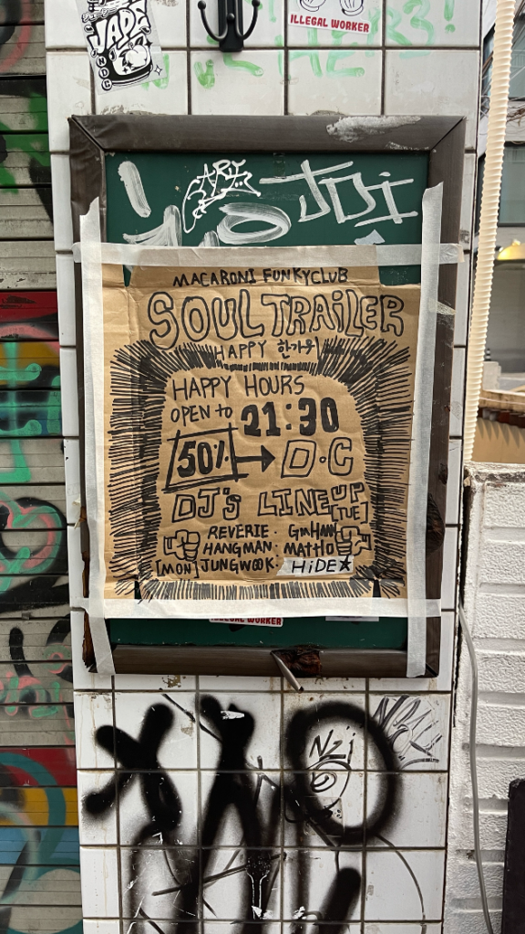
It’s a cardboard box, taped to a wall with masking tape, advertising a gig at the Macaroni Funky Club. It’s strategically placed out the front of said Macaroni Funky Club.
The ad is drawn with a black Sharpie and ticks a lot of the best-practice design boxes along the way: obvious hierarchy and clear call to action, with the exception of one typo, quickly fixed with more masking tape. It’s the best piece of creative outdoor advertising I have ever seen.
No print ready checks, no ensuring the PDF is setup to CMYK and 300dpi resolution specs. No approvals. No feedback. No worries.
And most importantly, the ad worked. I’m heading there tonight.

Julie Herczeg, account manager – Wellcom
Advert 1 – Uncle Toby’s Oats (1990)
Being one of six kids, we ate porridge a lot, and it wasn’t our favourite all of the time. But we endured.
To this day every time a make porridge, I say “that’s naught how you make porridge” in my head…. sometimes out loud.
Advert 2 – Maccas Big Mac Chant (1980/90s) and 2024
Memorising this was a goal and felt so good when achieved.
Tim Kirby, partner – Galore Creative
From a rather long short list I thought I’d share Schweppes ‘Burst’, created by George Patterson Y&R in Melbourne.
There are so many reasons why I love this ad, but let’s start with the music. Finding exactly the right track to take an ad to the next level is a mysterious form of alchemy and when it’s done right the impact is dramatic. This ad introduced me to the brilliant Cinematic Orchestra and the song, To Build a Home, is a searingly beautiful score that multiplies the impact of the incredible visuals.
Those visuals, shot at 10,000 frames per second, are both stunning and fascinating. It has always stuck with me as an example of pure film-making craft. Something I could watch for a lot longer than the 90 seconds of the ad.
The reason it’s such a great ad though is that the audio and visual craft are harnessed in a very singular way to bring to life the brand’s idea of ‘Schweppervescence’. The bubbles in the product of course, but also the uplifting feeling that the brand wants to convey. This is proper brand advertising: it’s emotive, it’s simple, and it ultimately achieves what most advertising fails to do – it grabs, and then keeps, your attention.
See also: The Ads That Made Us: Wagon Wheels, Qantas and Sony Bravia’s bouncing balls
–
Top image: Benny Moore, Julie Herczeg and Tim Kirby.

